
Saturday, June 11, 2011

Friday, June 10, 2011
Winter in Wagga


My Winter in Wagga Wagga logo was hard to establish as I tried to stay clear of the snowflake but after experimenting with one design I found that in this instance that the design worked. Each poster was designed to target a different topic and in turn targeting different demographics. I believed this to be the most effective way of advertisement so that it braches out to everyone and not just adults.
The imagery at the top of each poster is there to attract the eye. The information is short and to the point as well as easy to read. I felt that displaying the topic down the side of the poster was necessary in informing the reader of the topic before proceeding to read the poster as well as to help fill some negative space.
At the bottom of each poster I was sure to include an actual local image of Wagga to help promote it with both text and imagery about Wagga Wagga. I wanted to carry this same design over in each of my posters so that they could easily be placed together and not look like posters advertising completely different ideas. I made the dimensions for the poster 180mm x 297mm this was due to the fact that I felt a A4 poster looked ugly I preferred a slimmer design that had a much cleaner and more professional feel to it.
Friday, June 3, 2011
Artist booklet


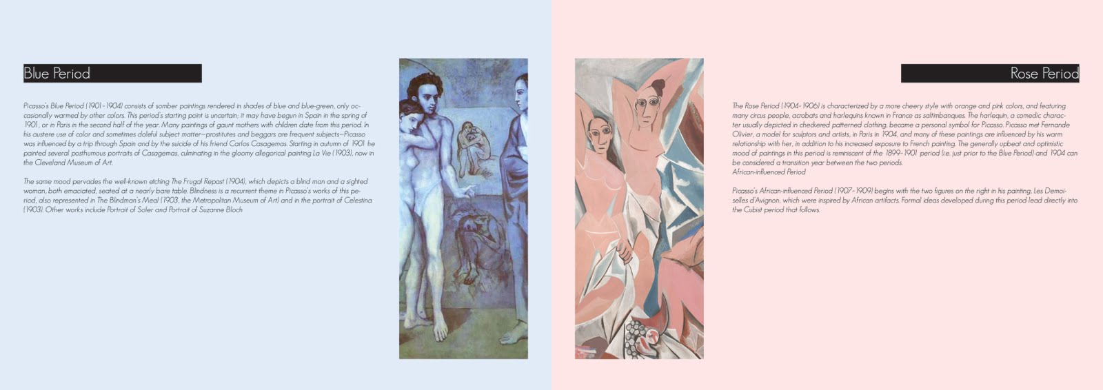

I have designed an artist booklet, which can be displayed at any exhibition regarding Pablo Picasso. In this booklet there is a series of images and information regarding Picasso’s works and his life.
The title for the exhibition ‘Shape of Reality’ came from the idea of how Picasso paints his artworks and perceives the world. He did not paint how he saw things he painted things for what he thought they looked like. Looking at it from the perspective that he might not have thought the world to be round but in his reality have seen it in a different way, hence the title ‘Shape of Reality’.
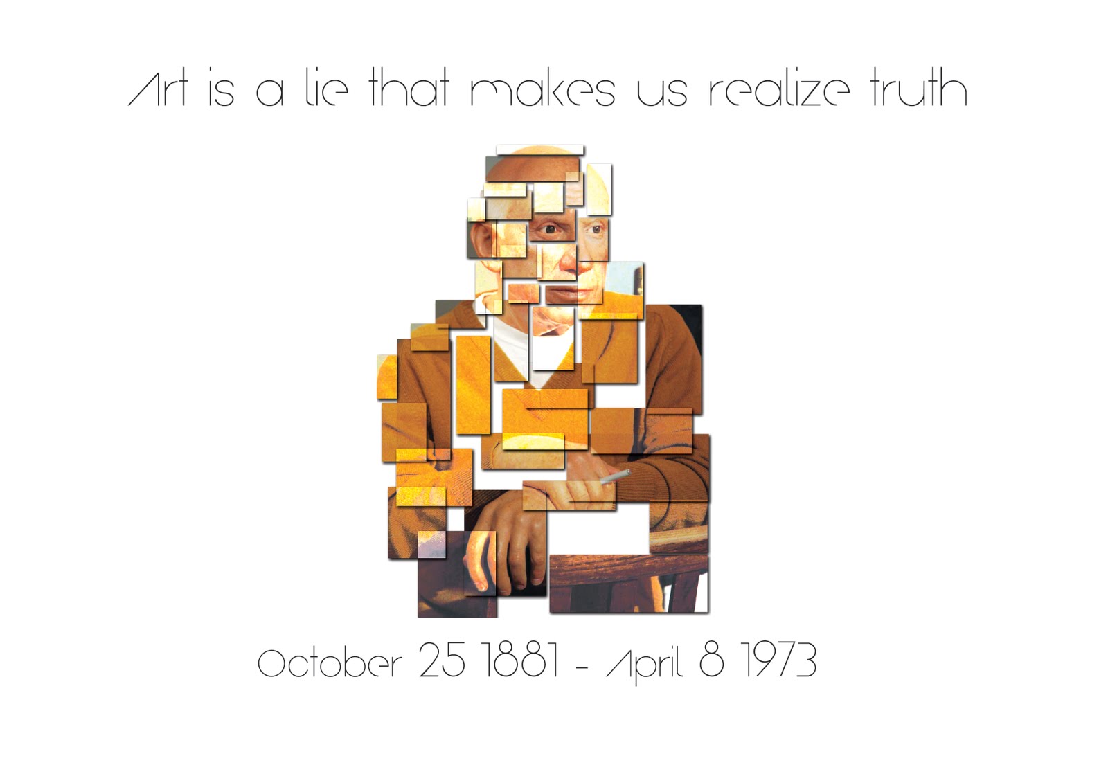
The front cover is a simple white background with to headings coming from both sides of the page. I also placed an image of Pablo Picasso on the front cover but found a way to fracture the image to make it look more abstract. This purely for the style of Picasso’s artwork as he did not focus on making his paintings look realistic but approaches his works with an abstract idea.
When it came to the design of the inside covers I decided to keep things very crisp and clean. Each page consisted of a heading, a body of text and an image. The set out of each page is then mirrored onto the next. The imagery placed on each of the pages relates in some way to the style of artwork suggested in the text based on the time period or art movement.
There are two pages in the booklet with which I decided to place a background colour. The two pages focussed on two periods Picasso was involved in, the blue period and the rose period. The page titled blue period had a very light blue background, which I felt really brought out the image I had decided to use for that page. The rose period had a very light shade of pink used in the background. Once again I felt that this brought out the image added something extra to the page.
The back page was another abstract image of Picasso and above that I had the quote ‘Art is a lie that makes us realise truth’. I did this because I feel that Picasso had some very inspirational quotes that I feel benefit both artists and designers. And finally below that image I displayed the day of his birth and his death as I thought it was necessary.
Thursday, June 2, 2011
Webpage header

Just something different i decided to do for my webpage just to make it look that tad prettier
Wednesday, June 1, 2011
Rising Sun Pictures
Rising Sun Pictures are a passionate team of producers, artists and technicians, known for providing complex visual effects and cg character work to feature film clients all around the world. With a capacity to scale to over 750 shots per year, Rising Sun has recently worked on films such as Terminator Salvation, the Harry Potter series (The Goblet of Fire, The Order of the Phoenix, The Half-Blood Prince, The Deathly Hallows), X-Men Origins: Wolverine and Watchmen.
From humble beginnings providing digital effects and 3D animation for the Australian television, film and multimedia industries, Rising Sun Pictures has evolved to become an internationally respected provider of visual effects for feature films. Rising Sun’s filmography now exceeds the 60-feature mark, not bad for 15 years collaboration with some of the industry’s top filmmakers.
The amount of involvement Rising Sun has on each feature film it works on can vary wildly depending on what stage of the production it is called in. This in turn affects how Rising Sun itself approaches the client brief. “Each production is different, and the amount of information we receive from our client determines how we approach the creative solution,” Cope explains. “Some projects allow us to get in on the ground level and contribute ideas, concept designs, pre-visualisation and onset supervision. Others may come to us with background plates, which have already been shot, that we’ll then need to augment. The look is mostly driven from our art department, but also from the VFX team through workshopping ideas and experimenting with various techniques that might deliver the look we are after.
Regardless of the context, however, attention to detail is key as apparently we humans have an uncanny knack for noticing anything that doesn’t fall into place. This can encompass all elements from ensuring continuity of the lighting and colour, through to how the background appears in the rear of a shot. Rising sun pictures work tirelessly on single shots that can go through up to 100 viewings before being having a final copy.
Rising Sun Pictures offers a wide range of visual and digital services. They have a vast range of cliental around the world from the very famous Harry Potter series to the film Australia. They offer services not only of 3D digital animation and creation but offer 2D conceptual art. They also provide story-boarding and previsualisation.
They are able to integrate live action with computer generated environments.
There wasn't much information on Rising Sun Pictures and they were lacking information about their company and this was all the information that I could find on their work practices and clients.
Wednesday, May 25, 2011
The Chopping Block
Portfolio:
- Chop Shop Merch:
It is their main product sold online. The inspiration for their work is all things nerdy or geeky, which can be defined by the obsessive nature of our culture rather than simply appealing to math and programming nerds.
- Consolidated Theaters:
We asked to rebrand the website with an elegant Hawaiian feel to it that doesn't come across to the average person as too over-priced.
- Me Ra Koh
Is a photographer on a mission to empower women through her images. Chopping Block created a simple but elegant Wordpress themed website for her, also with a simple identity.
- Phish Festival: "Save The Date"
Is an interactive website for the band Phish. It was done by creating an open map of the US and as each state was eliminated in the running for the band to play there, each state would be removed in a random and bizarre occurrence.
- Rachael Ray
Created a website that combined all things Rachael Ray into one go-to site.
- TBS
Created a game for the TV series, from one of the episodes "ten Items or Less". The game involves the latest programming 3D technology from Flash called Papervision, simulating a real life grocery isle and turkey bowling.
- They Might Be Giants
US band, created the theme and album cover for their first album "NO". They also created an interactive CD/ROM for the band.
- The Happiness Project
Website designed for Gretchen Rubin as an upgrade from her blog to put her theories into practice.
other clients and portfolio pieces have been:
Dilbert Identity: United Media
Qelavi Identity
Climate Central
The chopping block manage their own website utilizing a large amount of JavaScript to create an interactive website. Giving viewers the option to view their portfolio and their future projects. The chopping block also have their own blog linked to this page. Here they talk about their work as well as several other topics even some not related to design.
They also have their own online store where viewers can purchase any poster or print design shown. The chopping block helped with the design of websites such as Consolidated theatres, Me Ra Koh photography, Phish, Rachael Ray and many more. Their goal is to continually push the boundaries of interactive web.
Wednesday, May 11, 2011
Animal Logic
Not only does the company Animal Logic have a vast client base throughout the world they also have a long history of developing and supporting software products. They have created and built on software products such as Mayaman, Maxman, Softman, PRman. By developing these programs and software animal logic has made 3D programs and software available to not only big businesses but one-man businesses from home.
Animal Logic has worked on many high end visual effects for commercials and television programs. They have worked and designed projects for clients such as Cartoon Network and Spicks and Specks they have worked on the award winning film Happy Feet. In November 2009 Animal Logic ranked 447 in the Top500 super computer sites.
Animal Logic has several studios in Sydney, Los Angeles and Santa Monica.
Their work targets several different audiences from children with films such as happy feet, babe and legend of the guardians to adults with films such as 300, 28 weeks later and world trade center. It is hard to develop a single opinion on them as if there is something you don't like made by them then there will most certainly be something else that you would like. This is a result of several unique advertisements and filming effects that adhere to everyone's likes and interests.
Subscribe to:
Posts (Atom)