Monotone
 – My monotone cover is very simple. It consists of a completely white background save for one silhouetted figure with a very dim horizon in the distance. This cover I believe to be monotone through its minimal use of colour as well as imagery. The typeface is a very thin sans serif typeface called eurofurence light. I felt that when the imagery and type were placed together it created a very aesthetically pleasing monotone book cover.
This cover relates to the book in the way that the main character ‘Holden’ wishes to become the saviour of lost children and someone to guide them through the times when they are unclear and lost labeling himself ‘The Catcher in the Rye’. This of course is referring to kids with drug addictions, depression and violence. Although at the end of the book he realises that he can never be the catcher in the rye as he himself is also lost. He must find himself before he can help anyone else. I feel that the imagery used in the cover portrays ‘Holden’ as he sees himself at the end of the book, completely lost and looking for a way out beyond the horizon.
 Modern
 – The book is set in the early 1900’s making applying a modern theme simple. My approach to the modern theme was simple; I used an image of people crossing a road. The main things that I felt made the image appear modern were the type of clothes that the people were wearing as well as the shear amount of people crossing the road at the same time. Since the population has grown exponentially since the early 20th century. For the type I looked into how dependent we are in modern times on technology. For this reason I felt that a digital typeface was necessary. This typeface is called LCDMono2 Bold.
The story ‘The Catcher in the Rye’ surrounds the feelings of teenage angst and alienation as well as venturing into a new environment. In the image I made it so everyone was black and white except for one man. This man is my representation of ‘Holden’. Making him the only one in colour creates that sense of alienation and not belonging, which is a key theme throughout the entire book.
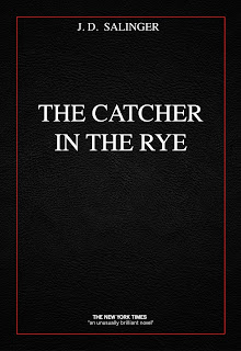
Classic – For my classic book cover on ‘The Catcher in the Rye’ I went for a fairly simple design making a black background surrounded with a thin red border with white times text. After looking at many older book I could see that a plain cover was used quite frequently and decided this would best portray classic. In the background there is also a leather texture included purely for the reason that many older books had their covers made from leather and therefore are able to stand the test of time. I felt that times was an appropriate typeface to place on my classic cover as older books and writing itself was usually displayed using a serif typeface and to me, times had that effect.
As the story of this book is based on alienation and teenage angst I felt that black leather was an appropriate colour for the cover. The red border represented the violence in the book, which the main character ‘Holden’ tries so desperately to avoid but is constantly confronted by it. The black in on the cover also representing Holden’s darkness that he must confront and venture into. For these reasons I believe that this cover portrays the story of ‘The Catcher in the Rye’ as well as creating the aesthetic of having a classic cover.
 Retro
Retro – I found this particular book cover tricky. After research into retro many of the images I found were bright vector illustrations of lines and patterns consisting of several different colours. These themes did not suit the story of ‘The Catcher in the Rye’, which was a dark and depressing story. As a result I vectorised a selection of images and tried to keep the colour to a minimum, but tried to keep the patterns used in retro works as part of it. The one colour that I did use was blue which is often associated with depression. The typeface also had to go alone with the effect of line patterns. The typeface that was eventually found and used is called KilledDJ. Although parts of this portray a grungy theme I hope that the retro part of it comes through more.
The idea of placing a character looking out over a city is to show what lies in front of him and what he must conquer. ‘Holden’ Ventures into a new world and must adapt to it if he ever wishes to become the catcher in the rye.
 Dynamic
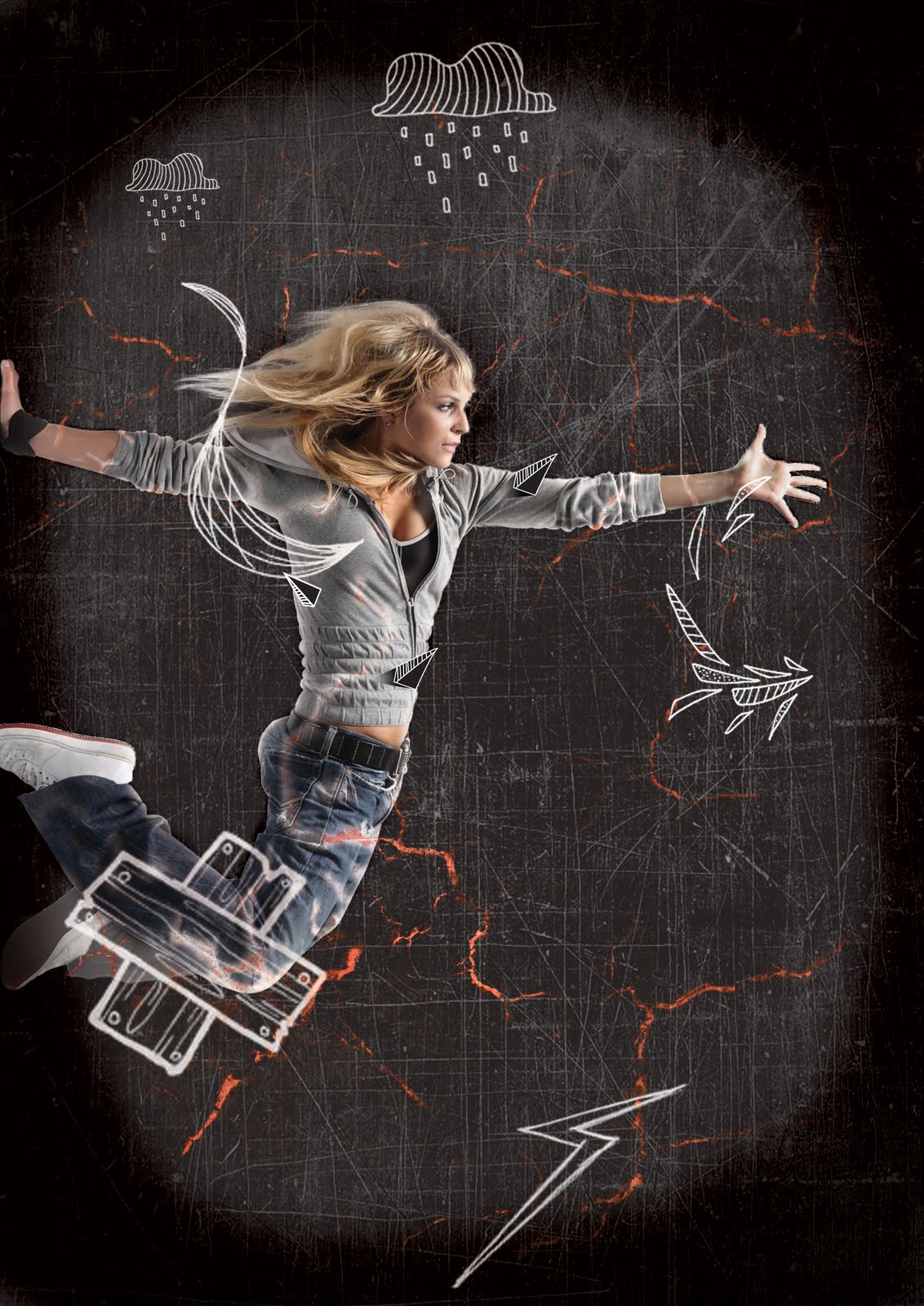
 – The image used to portray this them is of someone walking amongst a series of shelving. A slight motion blur has been added to give the image that effect of movement. The colours appear to be a selection of blues, which I feel assist the image in helping it create more movement. The tyeface used is called Arual light. I chose this typeface because of one particular character in the type. That was the leter ‘A’. In this typeface the letter ‘A’ is shown on an angle creating that sense of movement.
‘Holden’ runs away from school, from home and from everyone else. He is constantly running from something. I feel that this imagery suits that and that the theme itself suits the book even further.
 Grungy
 – This theme is very dark. The cover image is of a man at the end of a very dark tunnel walking into the tunnel. There is minimalistic use of colours in this piece mainly shades of white, black and grey. The typeface used is called The Action of the Time New. I felt this type based on its distorted and cracked form helped portray the grungy feel that was intended.
The story constantly talks of ‘Holden’s’ troubles and that he feels lost. In the book he must walk through the unknown to become who he wants to be. The man in the image symbolizes ‘Holden’ beginning his journey into the darkness.
 Futuristic
 – For my futuristic cover I used an image of a young man looking out onto an endless city. The top part of the image consists of bright lights and clock cogs. The young man appears to be wearing some sort of headphones, which combined with the rest of the imagery gives off a futuristic effect. The colours used in this image are primarily different shades of green, this in turn strengthening the futuristic look. As most people in the world associate the colour green with aliens and aliens are perceived as a type of sci fi being, this further pushing the idea. Once again I went with a white typeface this time using a typeface named space age. (I doubt any explanation why is needed)
The man in the image looks as though he is walking into an environment that he is completely new to. This strongly relates to the book as the main character ‘Holden’ runs away from school and must adapt to his new environment, which he feels slightly intimidated by.
 Aggression
 – This book cover is able to portray two themes both aggression and dynamic, but I have chosen it for aggression. The colours used are minimalistic, a simple combination of black and white. The distorted image in the centre is of a man screaming. I felt this imagery clearly displayed aggression as well as frustration through his movement. The typeface used is called Rat Infested Mailbox. I chose this because the type itself has a very tormented look about it, as if the writer was frustrated and took little time to write it.
‘Holden’ must constantly confront things that he is afraid of and finds that many people with which he stumbles upon are exceedingly aggressive towards him. In turn this frustrates Holden, which results in him becoming frustrated and aggressive.
 Passive
 – I used a fairly calm and relaxing image for this cover. An image of a man standing on a beach looking at his reflection in the freshly wet sand. I felt this image had very little happening in it and was not forcing the readers eyes to analyze the book cover. The colours work almost like a gradient, stating dark at the top and turning into light. Passive to me means peaceful and calm, when I think of those two things my mind immediately takes me to the beach. The typeface used is called Europe Underground. I chose this font because it is simple and clean. Nothing about it is complex or hard to look at.
The connection to the book itself has very little to do with the beach but focuses more on the reflection. ‘Holden’ knows what he wants to become but when he looks at himself at the end of the book he sees that he himself is lost and unable to see clearly. I felt having the focus of the cover on a unclear reflection would help illustrate that fact.