Friday, October 5, 2012
Website self assesment
A website is one of the most important things that a designer can have. It is a way for them to reach a mass audience immediately and is one of the most effective ways of advertisement available. In these websites designers often simply look at exhibiting their work and communicating the type of work that they do as well as their contact details for the job. But the overall look of the website is also important. A designer does not need nor should it look cluttered with information, pictures and videos that make it almost impossible for the user to understand what they are looking at let alone navigate the page. The site should be clean and easy to navigate.
This was an approach that I have always taken when designing not only my own websites but also all my freelance jobs. In my website I wanted to have a simple layout with type situated only where it was needed. The home page is designed, as you would expect, a simple design with a banner in the middle of the page with the words welcome typed below it. The home page should help gauge the viewer on exactly what type of work you enjoy doing or the type of work you specialize in. It is also important to place you own personal brand identity somewhere on the page. In the top left corner of the page my identity will be there on every page.
In this website I added a few tabs up the top right corner for people seeking more information with a page labeled ‘about me’. This page describes how I became interested in graphic design as well as the road I took to get where I am. There is also a portfolio page, which contains most of my best works on a constant slideshow for all to see. I have also linked my blog in this website where people can see all my previous works from back when I first started graphic design or to see how I created my designs.
Ultimately I feel I have achieved everything that I went out to achieve with this website in designing something that looks clean, easy to navigate and most importantly reflects exactly what I do.
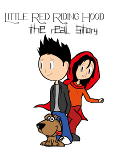
Zine Cover 'the real story'
So here is one of my more recent works that i did for an assignment at university. Just putting it out there I am not the best when it comes to illustration so I try and make things look as kiddy as possible when it comes to illustration, mainly because it seems to be the only part of illustration that I am good at. Anyway this assessment was to create a zine based on a fairy tale that we could tell in whatever way we pleased. I decided to do mine on Little Red Riding Hood. My version of the story simply illustrates that idea that what if the story was a lie (I know its a fairy tale). But what if all that happened was Red Riding Hood simply saw a dog approach her and she wanted some attention for it, so she told her friends a lie.
Anyway here is the front cover for the zine. Here I will show you a very quick look at how I created it.
 So before I started using illustrator I sketched out the images and scanned them into the computer.

 After they are scanned into your computer take them into illustrator and outline the entire image using the pen tool.
 After the entire image is outlined use the live paint feature to fill in the areas with the colour. Rearrange the characters in whatever way necessary and the you are done.


Tuesday, December 6, 2011
Lego packaging

For my packaging assignment I decided to stick with the idea of lego. But we had to come up with a completely original idea that had not been attempted before. Due to this fact I decided to create Maclarens Bar from the popular TV series How I met Your Mother. This scene would also contain all the main characters in the TV show as well as several others to create the busy environment of Maclarens Bar. The target demographic for this particular piece was roughly ages 12 and up, maily targeting it towards people who would actually be able to watch the show. In total this assignment cost me roughly $150 due to the purchasing of lego pieces as well as paints and printing.
The final product was not exactly how I pictured it. To me it lacked all the fine detail that was needed. This was a result of both bad luck and poor time management. If this product had more detail then I would say that it would easily sell for roughly $60 for the whole package.
Friday, October 21, 2011
Experiment

We recently received an assignment where we must use our own photography and do as much post production on it as possible while integrating illustration into the image. This is a random image of ben affleck that I grabbed and used the illustrations and effects I wanted to apply to my own image. I don't mind how it turned out but I'm open to opinions.
Thursday, October 20, 2011
Into a Dream

This piece is based on the song "Into a Dream' by Tragedy Machine. In this work I tried to focus on the first two lines of the chorus "I fell into a dream where the stars burn the night. I fell into a dream for a year of my life." By adding two images of men falling I believed it showed the repetition in the dream and the calendar in the background showed the time line of the dream.
http://www.youtube.com/watch?v=n4_EHIjJ57c
Friday, October 14, 2011
Not alone


These pieces are based off the song 'Not Alone' by Red. The song as I interpret it speaks of how no matter how alone you feel got is with you. I decided to go from a different approach using deceased people instead of anyone representing god.
http://www.youtube.com/watch?v=4sGYHlreXO8
Dance with the devil


This piece is based on the song 'Dance with the Devil' by Breaking Benjamin. We all see the devil as a man but the devil has always been said to manipulate the minds of others, hense the idea to portray the woman as the devil. I have posted two very similar pieces up one where the devil is much more subtle and in the other I tried to make it as obvious as possible. I must stress that these images used in all my composites are not my own, all photography has been sourced from flickr, deviantart and google images.
http://www.youtube.com/watch?v=IFVUe9QO62U
Subscribe to:
Posts (Atom)