Friday, June 24, 2011

The Catcher in the Rye Book covers


Monotone – My monotone cover is very simple. It consists of a completely white background save for one silhouetted figure with a very dim horizon in the distance. This cover I believe to be monotone through its minimal use of colour as well as imagery. The typeface is a very thin sans serif typeface called eurofurence light. I felt that when the imagery and type were placed together it created a very aesthetically pleasing monotone book cover.

This cover relates to the book in the way that the main character ‘Holden’ wishes to become the saviour of lost children and someone to guide them through the times when they are unclear and lost labeling himself ‘The Catcher in the Rye’. This of course is referring to kids with drug addictions, depression and violence. Although at the end of the book he realises that he can never be the catcher in the rye as he himself is also lost. He must find himself before he can help anyone else. I feel that the imagery used in the cover portrays ‘Holden’ as he sees himself at the end of the book, completely lost and looking for a way out beyond the horizon.


Modern – The book is set in the early 1900’s making applying a modern theme simple. My approach to the modern theme was simple; I used an image of people crossing a road. The main things that I felt made the image appear modern were the type of clothes that the people were wearing as well as the shear amount of people crossing the road at the same time. Since the population has grown exponentially since the early 20th century. For the type I looked into how dependent we are in modern times on technology. For this reason I felt that a digital typeface was necessary. This typeface is called LCDMono2 Bold.

The story ‘The Catcher in the Rye’ surrounds the feelings of teenage angst and alienation as well as venturing into a new environment. In the image I made it so everyone was black and white except for one man. This man is my representation of ‘Holden’. Making him the only one in colour creates that sense of alienation and not belonging, which is a key theme throughout the entire book.
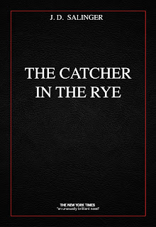

Classic – For my classic book cover on ‘The Catcher in the Rye’ I went for a fairly simple design making a black background surrounded with a thin red border with white times text. After looking at many older book I could see that a plain cover was used quite frequently and decided this would best portray classic. In the background there is also a leather texture included purely for the reason that many older books had their covers made from leather and therefore are able to stand the test of time. I felt that times was an appropriate typeface to place on my classic cover as older books and writing itself was usually displayed using a serif typeface and to me, times had that effect.

As the story of this book is based on alienation and teenage angst I felt that black leather was an appropriate colour for the cover. The red border represented the violence in the book, which the main character ‘Holden’ tries so desperately to avoid but is constantly confronted by it. The black in on the cover also representing Holden’s darkness that he must confront and venture into. For these reasons I believe that this cover portrays the story of ‘The Catcher in the Rye’ as well as creating the aesthetic of having a classic cover.


Retro – I found this particular book cover tricky. After research into retro many of the images I found were bright vector illustrations of lines and patterns consisting of several different colours. These themes did not suit the story of ‘The Catcher in the Rye’, which was a dark and depressing story. As a result I vectorised a selection of images and tried to keep the colour to a minimum, but tried to keep the patterns used in retro works as part of it. The one colour that I did use was blue which is often associated with depression. The typeface also had to go alone with the effect of line patterns. The typeface that was eventually found and used is called KilledDJ. Although parts of this portray a grungy theme I hope that the retro part of it comes through more.

The idea of placing a character looking out over a city is to show what lies in front of him and what he must conquer. ‘Holden’ Ventures into a new world and must adapt to it if he ever wishes to become the catcher in the rye.


Dynamic – The image used to portray this them is of someone walking amongst a series of shelving. A slight motion blur has been added to give the image that effect of movement. The colours appear to be a selection of blues, which I feel assist the image in helping it create more movement. The tyeface used is called Arual light. I chose this typeface because of one particular character in the type. That was the leter ‘A’. In this typeface the letter ‘A’ is shown on an angle creating that sense of movement.

‘Holden’ runs away from school, from home and from everyone else. He is constantly running from something. I feel that this imagery suits that and that the theme itself suits the book even further.


Grungy – This theme is very dark. The cover image is of a man at the end of a very dark tunnel walking into the tunnel. There is minimalistic use of colours in this piece mainly shades of white, black and grey. The typeface used is called The Action of the Time New. I felt this type based on its distorted and cracked form helped portray the grungy feel that was intended.

The story constantly talks of ‘Holden’s’ troubles and that he feels lost. In the book he must walk through the unknown to become who he wants to be. The man in the image symbolizes ‘Holden’ beginning his journey into the darkness.


Futuristic – For my futuristic cover I used an image of a young man looking out onto an endless city. The top part of the image consists of bright lights and clock cogs. The young man appears to be wearing some sort of headphones, which combined with the rest of the imagery gives off a futuristic effect. The colours used in this image are primarily different shades of green, this in turn strengthening the futuristic look. As most people in the world associate the colour green with aliens and aliens are perceived as a type of sci fi being, this further pushing the idea. Once again I went with a white typeface this time using a typeface named space age. (I doubt any explanation why is needed)

The man in the image looks as though he is walking into an environment that he is completely new to. This strongly relates to the book as the main character ‘Holden’ runs away from school and must adapt to his new environment, which he feels slightly intimidated by.


Aggression – This book cover is able to portray two themes both aggression and dynamic, but I have chosen it for aggression. The colours used are minimalistic, a simple combination of black and white. The distorted image in the centre is of a man screaming. I felt this imagery clearly displayed aggression as well as frustration through his movement. The typeface used is called Rat Infested Mailbox. I chose this because the type itself has a very tormented look about it, as if the writer was frustrated and took little time to write it.

‘Holden’ must constantly confront things that he is afraid of and finds that many people with which he stumbles upon are exceedingly aggressive towards him. In turn this frustrates Holden, which results in him becoming frustrated and aggressive.


Passive – I used a fairly calm and relaxing image for this cover. An image of a man standing on a beach looking at his reflection in the freshly wet sand. I felt this image had very little happening in it and was not forcing the readers eyes to analyze the book cover. The colours work almost like a gradient, stating dark at the top and turning into light. Passive to me means peaceful and calm, when I think of those two things my mind immediately takes me to the beach. The typeface used is called Europe Underground. I chose this font because it is simple and clean. Nothing about it is complex or hard to look at.

The connection to the book itself has very little to do with the beach but focuses more on the reflection. ‘Holden’ knows what he wants to become but when he looks at himself at the end of the book he sees that he himself is lost and unable to see clearly. I felt having the focus of the cover on a unclear reflection would help illustrate that fact.

Thursday, June 23, 2011

Water bottle design rationale & feedback summary

My first concept for my plastic bottle poster consisted of an image of a number of bottles expelling poisonous fumes and smoke. The idea behind this was to use imagery to make the viewer aware of what it takes to make a plastic bottle and show them what effect it has on the environment. I was so fixated on this idea that I did not take into account other ways that I could convey the same message in a much simpler format.

This was brought to my attention after our first group meeting with which everyone put forward their ideas for their posters. Our teachers advice to all of us was make everything more simple and stop thinking so complex. This advice was hard to take on as I kept thinking of ways to make the poster so aesthetically pleasing that I kept forgetting about creating an equal form vs function poster, only focusing on the form.

My final idea for my poster was an image of the world with a plastic bottle in front of it. The text read 'stop using plastic bottles' at the top of the page and then at the bottom 'look at whats at stake.' The typeface I used was called california. This typeface had a very earthy feel to it although it had a touch of distortion about it I felt it added to the idea that the bottles were destroying the planet. The entire background was black to give the out of space effect and to help the planet blend in and belong a little more. The idea behind the text 'look at whats at stake' was to make the reader think for a moment about the effect that it is having on our environment.

When the final design was put up for critiquing I must say that I was not happy with the final product. My idea was good but I felt that I could not execute it well enough. This was also explained to me by the class as they felt exactly the same way about it. In conclusion I do not see it as my best work and what I need to look into is making my ideas work better in the final design and always remember the phrase form vs function when designing anything. More research into the subject would benefit.

Water bottle project roughs


Generating ideas


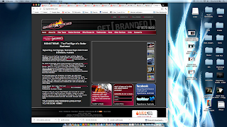
My idea was to create something simple and easy to use that did not appear to be over cluttered. As much as I disliked the logo I placed it in the banner. The resolution of the entire page was 960px by 720px. This was so that it would fit comfortably on any computer screen both normal and widescreen. Our client specified that he wanted a slideshow in the website so my proposed slideshow would remain on the screen at all times randomly selecting photos and displaying them next to the displayed text. I went with a black skin as I felt it was the only colour that would be able to be placed in proximity of the logo. I also did up a white skin for the website just as another option although I do not feel it is as good as the first.

Defining the design challenge

Were you prepared? Going into see our client for the first time I felt that I was prepared in knowing what questions to ask. Although I did feel a little nervous prior to the meeting.

Was the client prepared? Our first two meetings we had with our client we received no images or text that he wished to have placed into the website. In this way he was not quite prepared for what we needed from him.

Did the client know what they wanted? Our client had a fairly simple idea of what he wanted at first. He simply described that he wanted his logo and image as the focal point of the website. As we had further meetings with him his ideas for what he wanted kept evolving and becoming more and more complicated. What he wanted strayed further than what I believe a simple website was.

Was the client relying on your suggestions? Our client was listening to our suggestions but would often accept very few of them. Whenever we came up with an idea that we felt helped the look of the website our client had a different idea that we felt would not work aesthetically.

Did you behave in a professional manner? Yes we did. We always gave him a say and clearly stated what was possible and wasn’t.

Were you firm enough with the client? I do not believe I was firm enough with our client. As we were almost afraid to tell him what we really thought of his ideas and suggestions, which at times seemed tacky and unprofessional.

Were you intimidated by the client? No I wasn’t he was fairly easy to talk to.

Was the client intimidated by you? I do not believe so.

What other information can you elaborate with? After a while it seemed that our client was unsure as to what he actually wanted. He would tell us that he wants a certain concept changed then when presented with the new concept done according to his specifications he would suggest something else that would be almost identical to our original concept.

Undertaking research to inform the design solution


After looking at a series of sign writer websites it was noticeable that most of them were very cluttered with information. It was this that influenced me to make a design that was much simpler and a lot cleaner.

Saturday, June 11, 2011

Friday, June 10, 2011

Winter in Wagga


My Winter in Wagga Wagga logo was hard to establish as I tried to stay clear of the snowflake but after experimenting with one design I found that in this instance that the design worked. Each poster was designed to target a different topic and in turn targeting different demographics. I believed this to be the most effective way of advertisement so that it braches out to everyone and not just adults.

The imagery at the top of each poster is there to attract the eye. The information is short and to the point as well as easy to read. I felt that displaying the topic down the side of the poster was necessary in informing the reader of the topic before proceeding to read the poster as well as to help fill some negative space.

At the bottom of each poster I was sure to include an actual local image of Wagga to help promote it with both text and imagery about Wagga Wagga. I wanted to carry this same design over in each of my posters so that they could easily be placed together and not look like posters advertising completely different ideas. I made the dimensions for the poster 180mm x 297mm this was due to the fact that I felt a A4 poster looked ugly I preferred a slimmer design that had a much cleaner and more professional feel to it.

Friday, June 3, 2011

Artist booklet


I have designed an artist booklet, which can be displayed at any exhibition regarding Pablo Picasso. In this booklet there is a series of images and information regarding Picasso’s works and his life.

The title for the exhibition ‘Shape of Reality’ came from the idea of how Picasso paints his artworks and perceives the world. He did not paint how he saw things he painted things for what he thought they looked like. Looking at it from the perspective that he might not have thought the world to be round but in his reality have seen it in a different way, hence the title ‘Shape of Reality’.

The front cover is a simple white background with to headings coming from both sides of the page. I also placed an image of Pablo Picasso on the front cover but found a way to fracture the image to make it look more abstract. This purely for the style of Picasso’s artwork as he did not focus on making his paintings look realistic but approaches his works with an abstract idea.

When it came to the design of the inside covers I decided to keep things very crisp and clean. Each page consisted of a heading, a body of text and an image. The set out of each page is then mirrored onto the next. The imagery placed on each of the pages relates in some way to the style of artwork suggested in the text based on the time period or art movement.

There are two pages in the booklet with which I decided to place a background colour. The two pages focussed on two periods Picasso was involved in, the blue period and the rose period. The page titled blue period had a very light blue background, which I felt really brought out the image I had decided to use for that page. The rose period had a very light shade of pink used in the background. Once again I felt that this brought out the image added something extra to the page.

The back page was another abstract image of Picasso and above that I had the quote ‘Art is a lie that makes us realise truth’. I did this because I feel that Picasso had some very inspirational quotes that I feel benefit both artists and designers. And finally below that image I displayed the day of his birth and his death as I thought it was necessary.

Thursday, June 2, 2011

Webpage header


Just something different i decided to do for my webpage just to make it look that tad prettier

Wednesday, June 1, 2011

Rising Sun Pictures

Rising Sun Pictures are a passionate team of producers, artists and technicians, known for providing complex visual effects and cg character work to feature film clients all around the world. With a capacity to scale to over 750 shots per year, Rising Sun has recently worked on films such as Terminator Salvation, the Harry Potter series (The Goblet of Fire, The Order of the Phoenix, The Half-Blood Prince, The Deathly Hallows), X-Men Origins: Wolverine and Watchmen.

From humble beginnings providing digital effects and 3D animation for the Australian television, film and multimedia industries, Rising Sun Pictures has evolved to become an internationally respected provider of visual effects for feature films. Rising Sun’s filmography now exceeds the 60-feature mark, not bad for 15 years collaboration with some of the industry’s top filmmakers.

The amount of involvement Rising Sun has on each feature film it works on can vary wildly depending on what stage of the production it is called in. This in turn affects how Rising Sun itself approaches the client brief. “Each production is different, and the amount of information we receive from our client determines how we approach the creative solution,” Cope explains. “Some projects allow us to get in on the ground level and contribute ideas, concept designs, pre-visualisation and onset supervision. Others may come to us with background plates, which have already been shot, that we’ll then need to augment. The look is mostly driven from our art department, but also from the VFX team through workshopping ideas and experimenting with various techniques that might deliver the look we are after.

Regardless of the context, however, attention to detail is key as apparently we humans have an uncanny knack for noticing anything that doesn’t fall into place. This can encompass all elements from ensuring continuity of the lighting and colour, through to how the background appears in the rear of a shot. Rising sun pictures work tirelessly on single shots that can go through up to 100 viewings before being having a final copy.

Rising Sun Pictures offers a wide range of visual and digital services. They have a vast range of cliental around the world from the very famous Harry Potter series to the film Australia. They offer services not only of 3D digital animation and creation but offer 2D conceptual art. They also provide story-boarding and previsualisation.
They are able to integrate live action with computer generated environments.

There wasn't much information on Rising Sun Pictures and they were lacking information about their company and this was all the information that I could find on their work practices and clients.